Interdesign DEtroit
Design Core Detroit Brand Identity
The Project
Interdesign Detroit was apart of the the Design Core Detroit (formerly Detroit Creative Corridor Center (DC3)) rebrand sponsored project. Myself along with three other teammates created a complete and functional brand for Design Core Detroit to fully embody who they are and what they do for the UNESCO City of Design and the creatives around the Detroit area. We researched, sketched, created multiple iterations, refined, and created as many assets for this well-rounded brand identity. Each team member took turns presenting to top level executives throughout each stage of our design process. Below is our final outcome along with our design process.


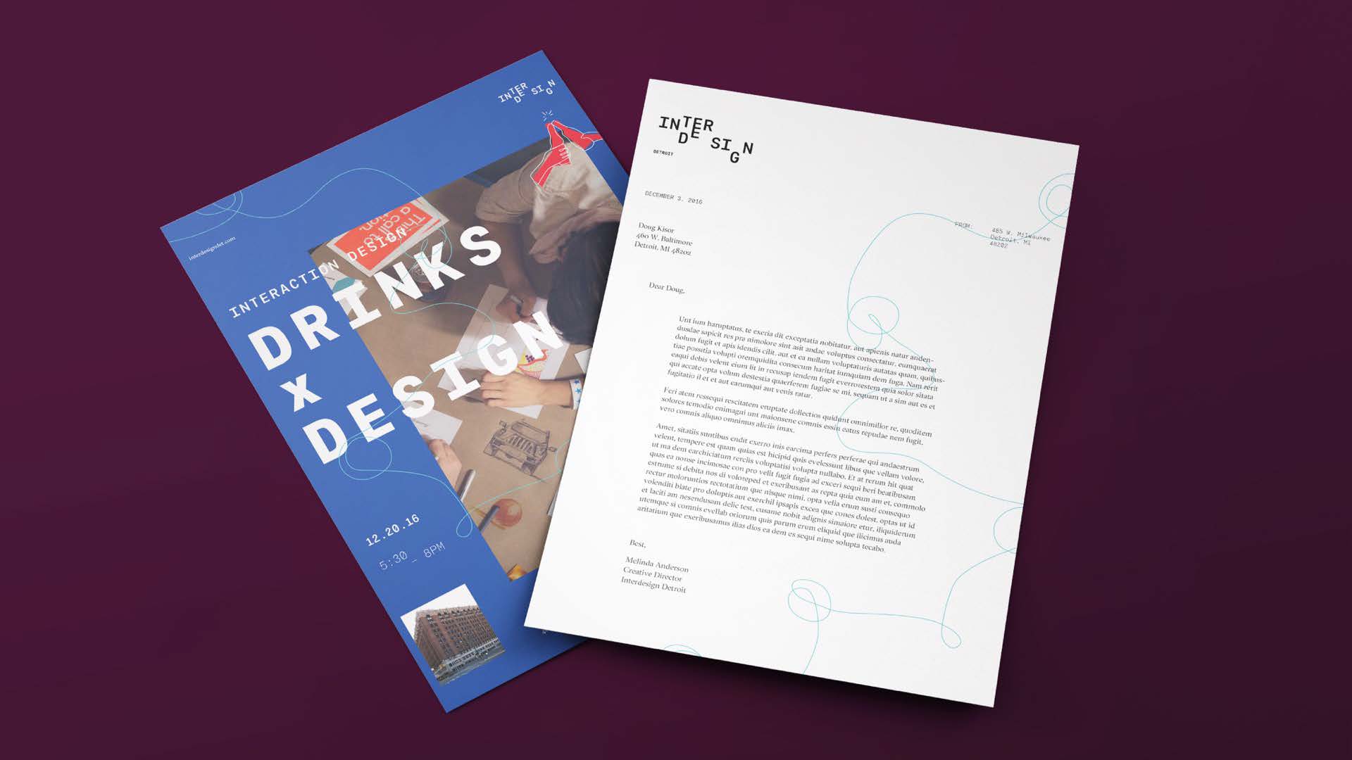
Letterhead
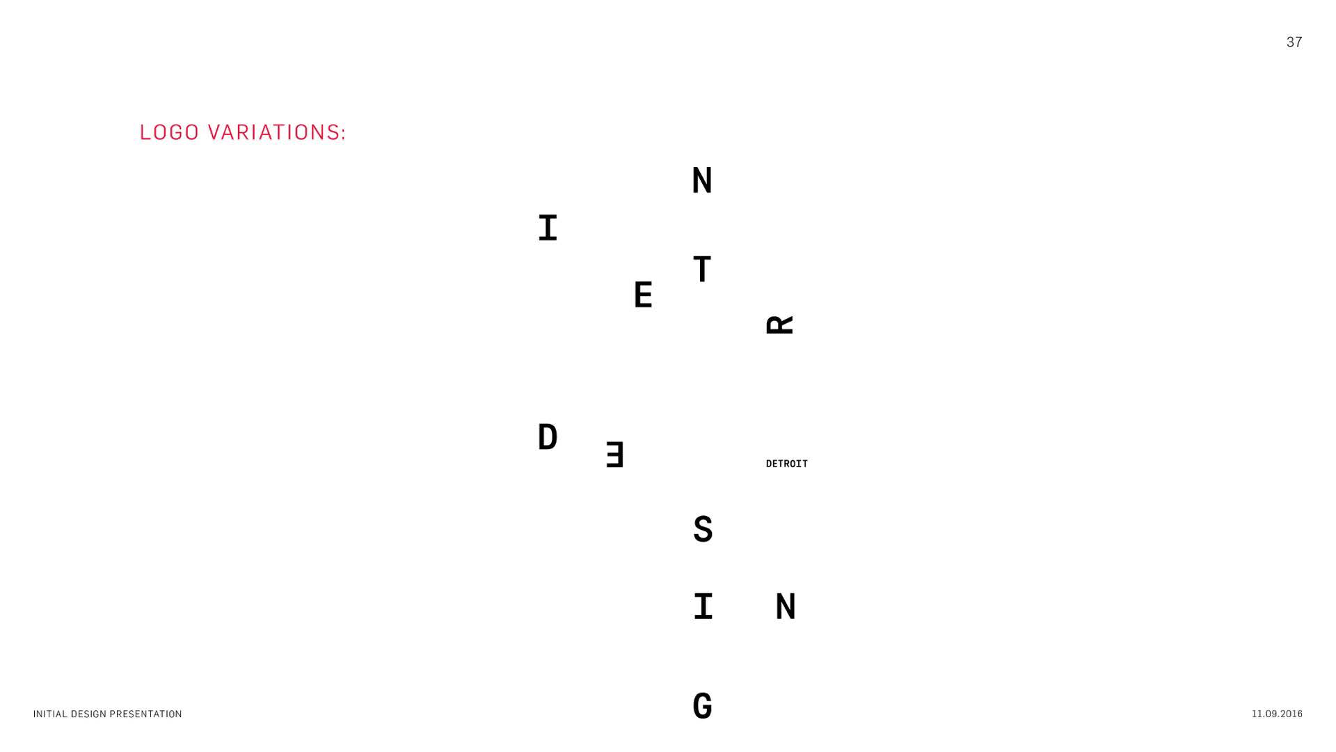
It is important that the most extreme variations of the word mark are always contextualized with their main, simpler word mark.The idea behind the letterhead design is for them to be dual purpose. They can act as just a professional letterhead, as well as, a flyer for an upcoming event.


Environmental Posters
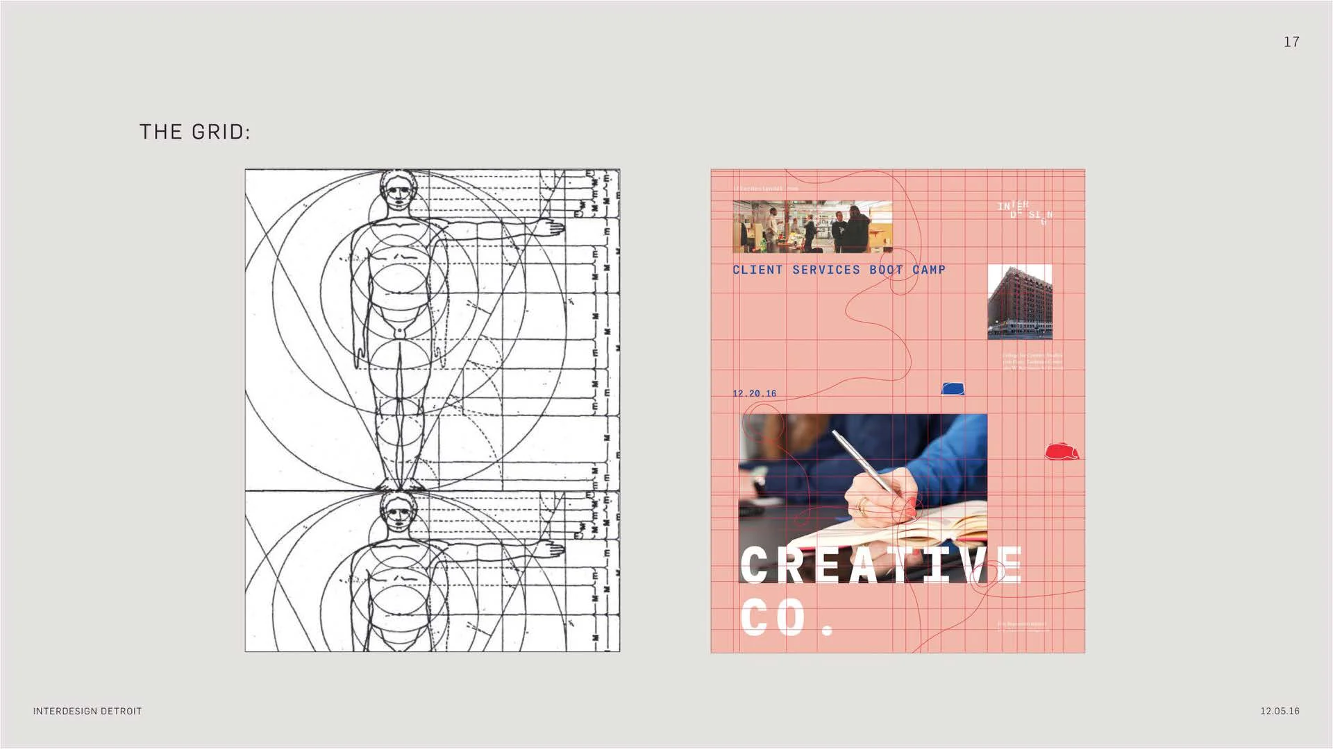
The focus in a spacial system is applied in more than just the word mark- but also the way that the combination of our assets interact with the space and each other. A secure system allows for poster series to be created for events, showing how different looking pieces can still be unified. Additionally, the deliverables can be shifted and scaled to be purposeful for multiple uses
DC3 Workspace Design
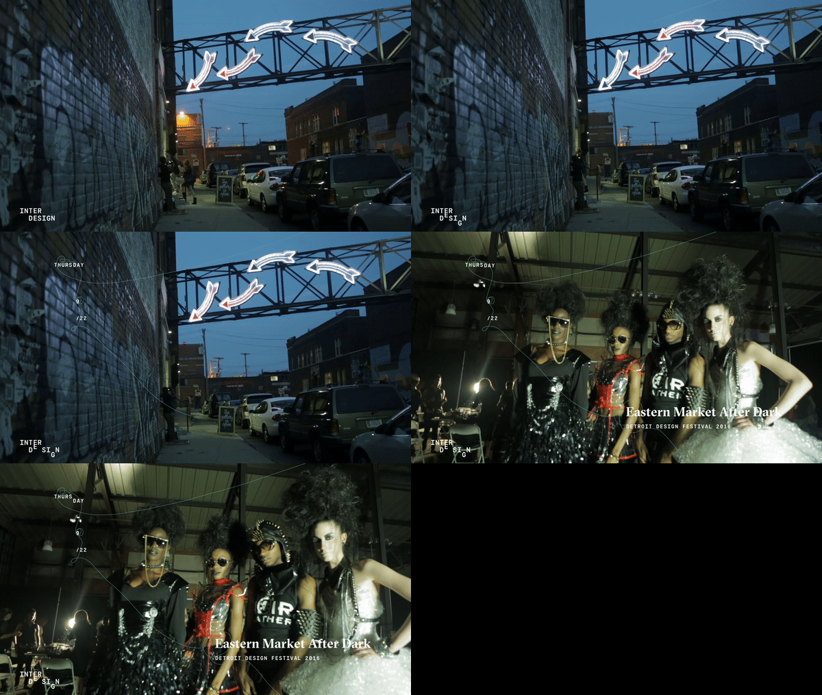
A projected window display that references the grid system dynamically shows the identity system in action, as well as, Interdesign Detroit's participation in the community.
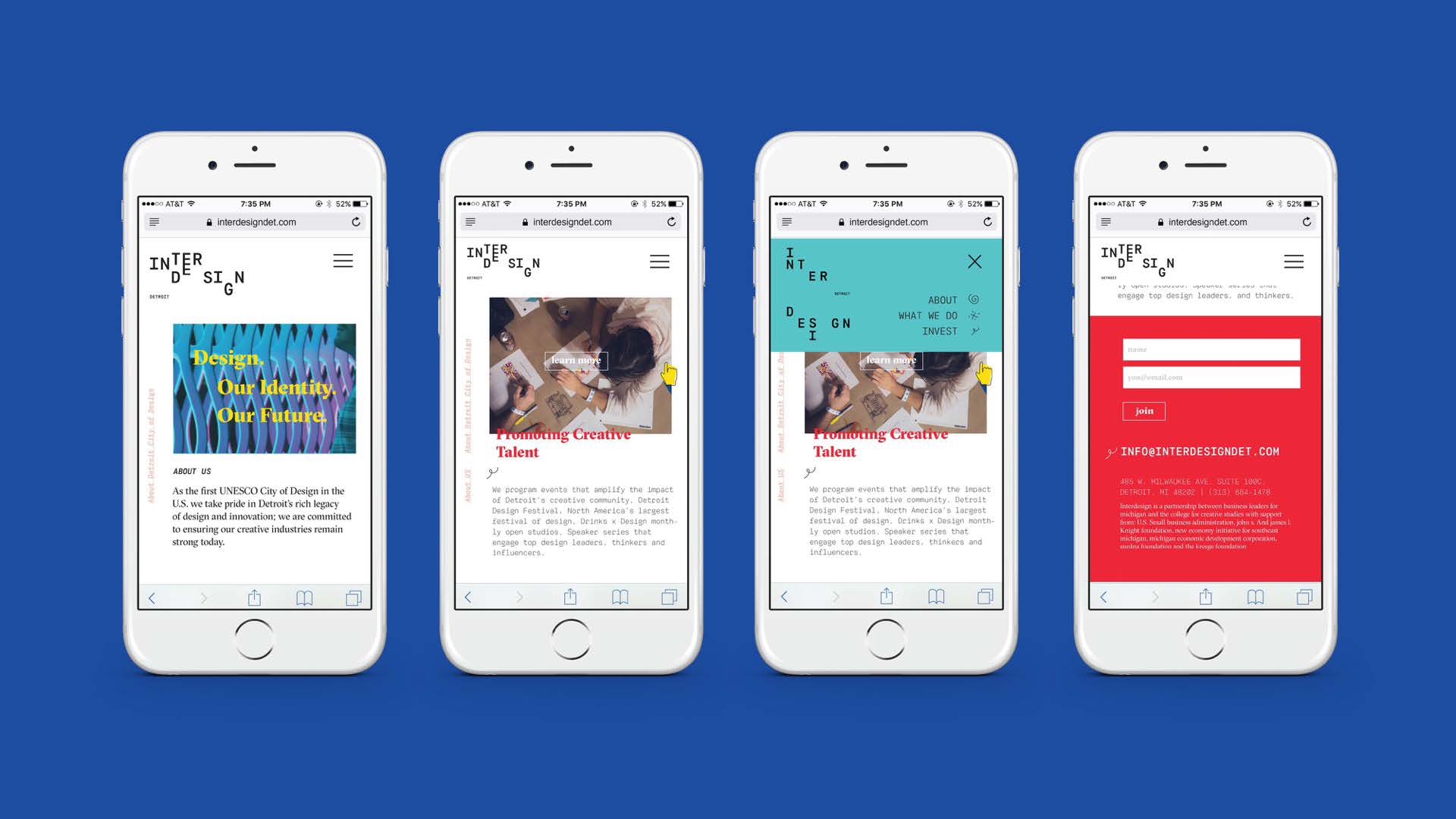
Website design
Similar to the posters the website takes on a minimalistic feel that still carries on the concept of pieces of a whole that represent the variety of services that Interdesign offers. The fluid user experience in this case acts as the connection that brings these concepts together.


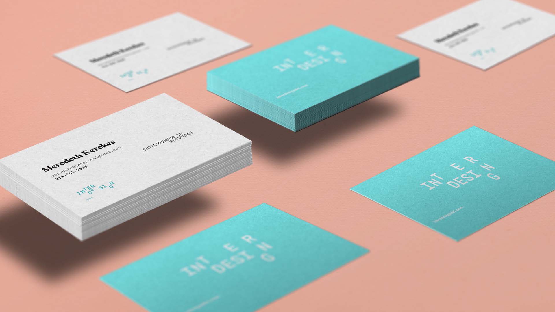
Business Cards
We wanted the business cards to be verstile and unique based on the person. Each business card's information shifts slightly within the grid to show the individuality of each employee. The use of the six colors in the established palette are used to further illustrate this concept.


Social Media
We applied Interdesign’s brand through all aspects of social media including: Facebook, Twitter, and Instagram. So no matter what social circle, the outreach and brand stay consistent throughout all platforms.



Branding Opportunities
The system can be applied to a fun little car, a witty mug, water bottles, t-shirt, a comfy hoodie, and even candy.
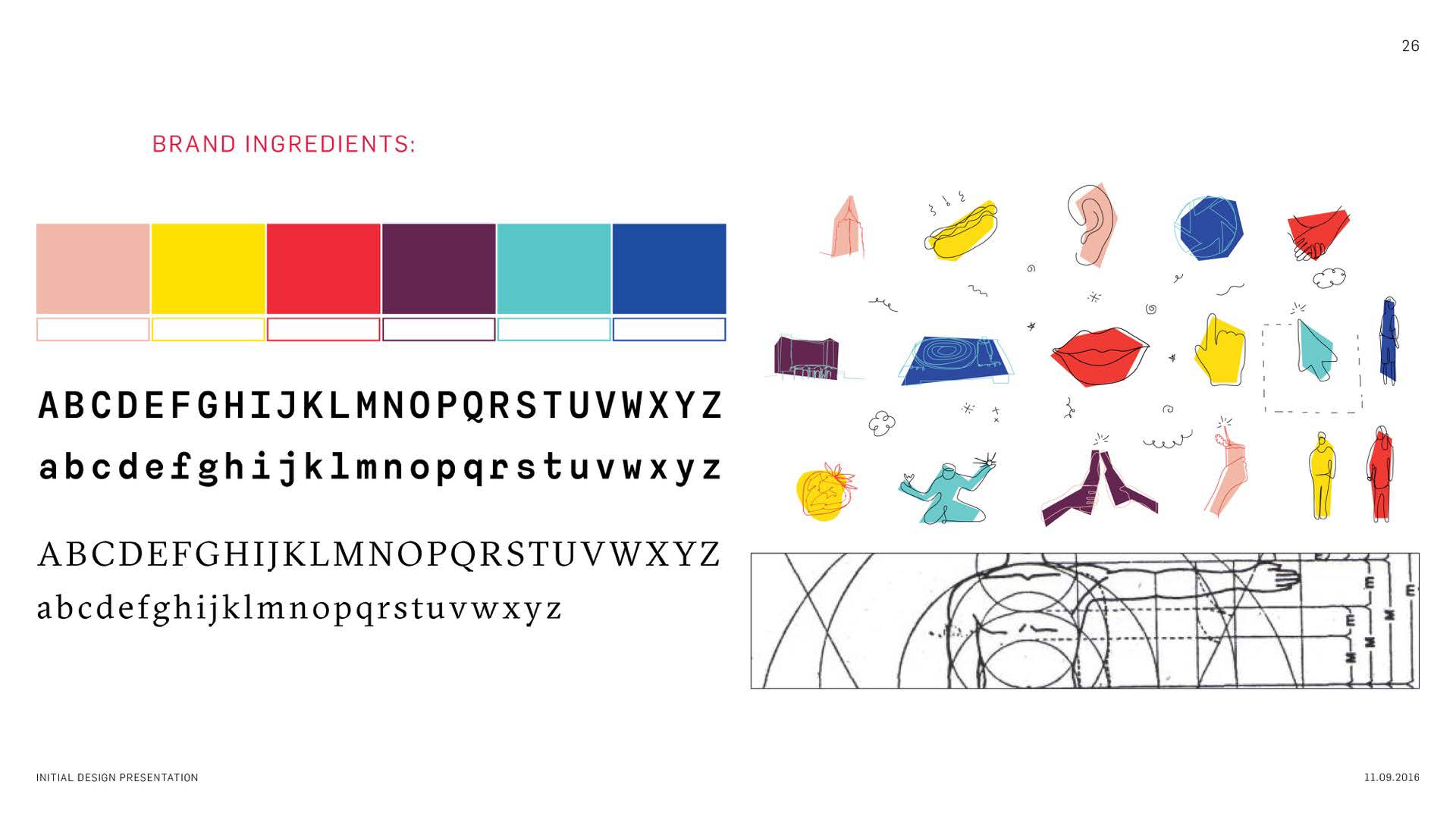
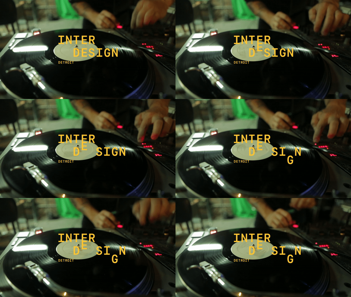
Over all, the system thrives through the creation of every asset, based on a secure kit of parts. Every ingredient assists the others to ensure the brand essence and promise are put in a visual context. Whether it is seen all together or as a simple logo build.


Future of the Brand
But a brand should be able to evolve and grow as time goes on. We created poster examples of how Interdesign Detroit can change and grow throughout the years.
Going from full bleed images to darker color palettes with pops of color to 2022 where Interdesign stays more vectorized with cleaner icons and no images. But yet sticking with the current grid structure.
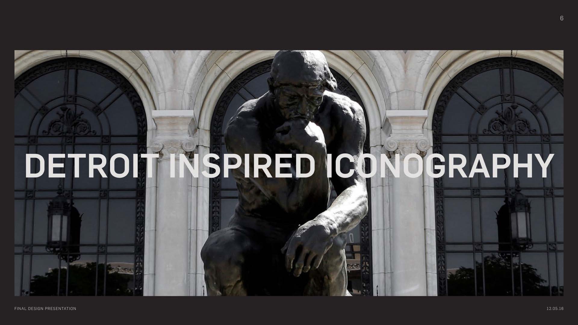
Design Process
